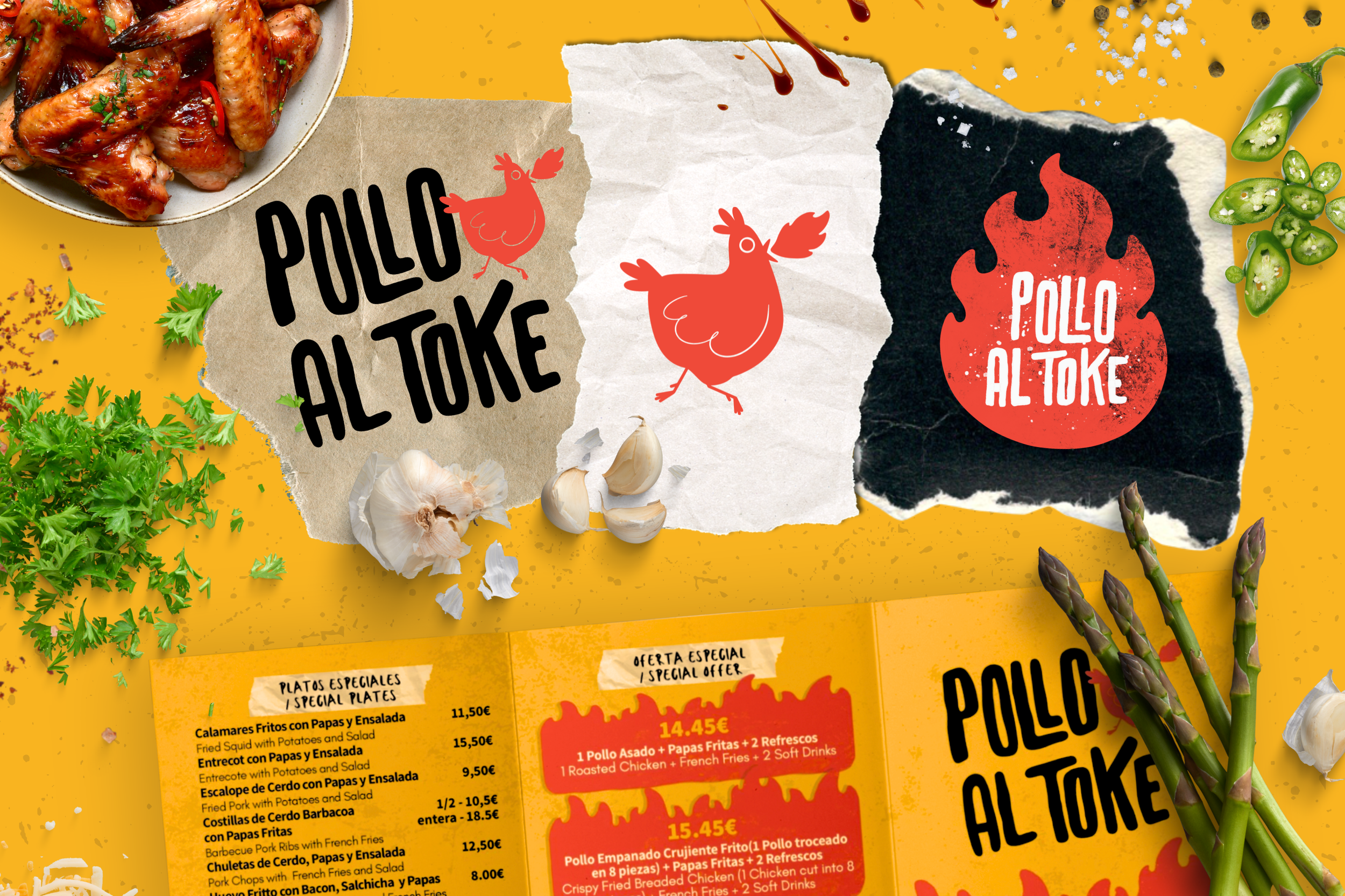
Polo al Toke
is a canary rotisserie chicken restaurant in the heart of Gran Canaria, blending Spanish and Colombian flavors with a bold, playful spirit. I was responsible for crafting its visual identity, including the logo, brand elements, and collateral assets such as menus, packaging, social media visuals, and outdoor signage.
Scope of Work:
Logo design (primary & alternate versions)
Custom mascot illustration (running spicy chicken)
Visual identity system (typography, textures, brand colors)
Packaging design (stickers, wraps, cups, takeaway bags)
Social media mockups & promotional visuals
Uniform and storefront design
Menu design (Spanish / Colombian cuisine focus)

Style & Concept:
The visual language combines playful illustration, grungy textures, and bold handwritten typography, reflecting a dynamic, street-style aesthetic. The brand mascot—a cheeky red chicken—adds humor and recognition, while the spicy flame shape logo communicates heat, passion and flavor.
The warm yellow and red color palette evokes both roasted spices and tropical energy, while ripped paper textures and hand-drawn elements create an authentic, casual vibe. Every detail—from aprons to delivery promotions—was designed to feel bold, fun and unmistakably "al toke."


Craving more than just great design?
Let’s cook up your next brand identity—spicy, crispy, and impossible to ignore.
Because just like rotisserie chicken, good branding should leave everyone drooling. 🍗🔥